New Top Navigation
19 Jan 2024

Jack Kennedy
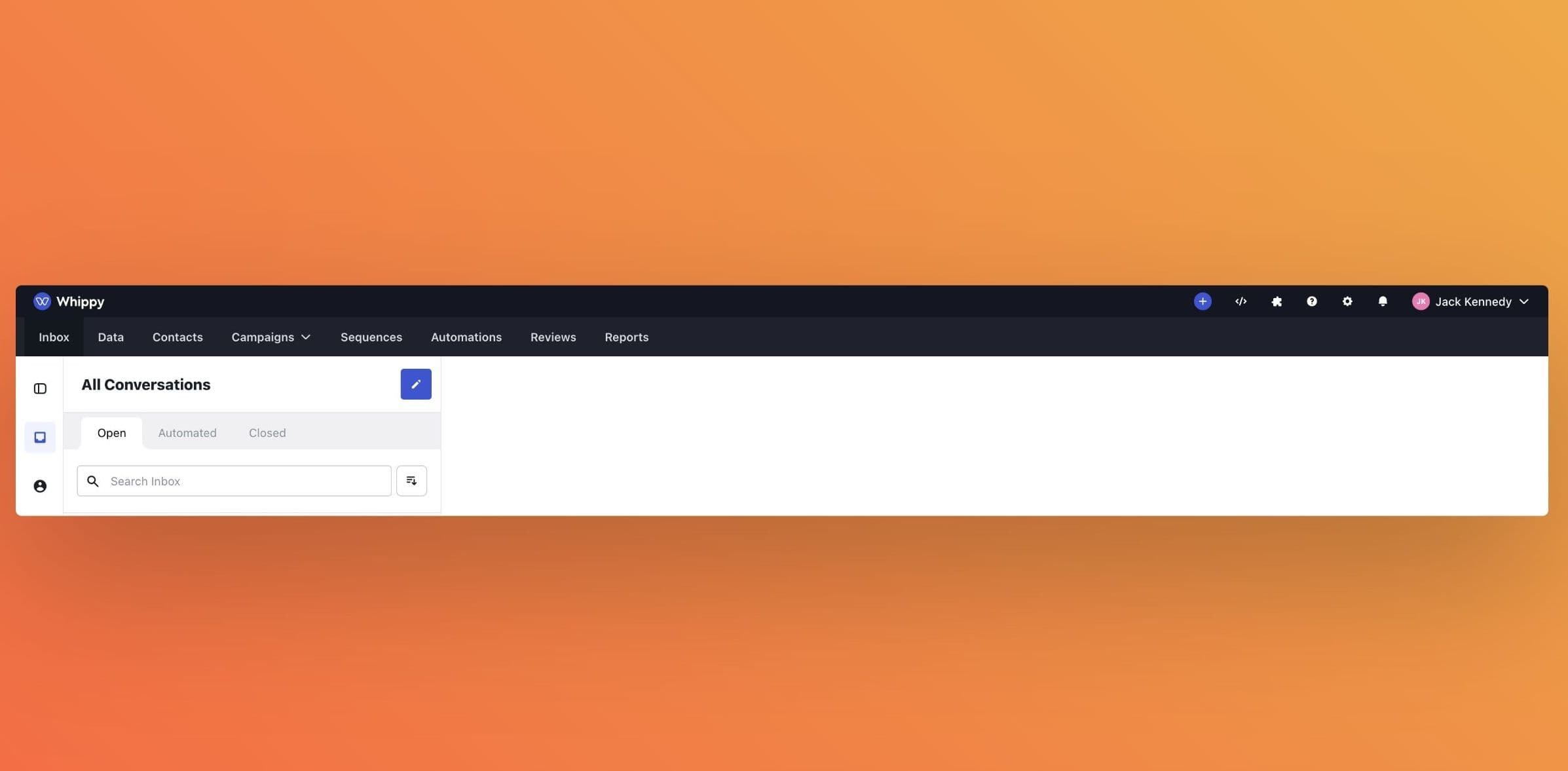
We are delighted to roll out a revamped top navigation design in Whippy, focusing on enhanced accessibility and visibility for our core products. This update brings a more intuitive navigation experience, helping you find and use Whippy's features more efficiently.
- Prominent Placement of Core Products: Our core products, including Inbox, Contacts, Campaigns and Sequences, are now positioned at the forefront of the top navigation bar. This change ensures that you have immediate access to the tools you use most, enhancing productivity and ease of use.
- Vibrant New Color Scheme: We've updated the navigation bar's color to a more striking shade that not only stands out but also aligns with our brand's energetic and modern identity. This new color scheme is designed to improve visibility and make the navigation experience more engaging.
- Streamlined Access to Ancillary Products: Settings, the Developer Portal, and the Integrations Marketplace, along with other ancillary products, have been reorganized and are now more prominently displayed. This adjustment allows for quicker access to these resources, supporting your customization and integration needs more directly.
With these changes, navigating through Whippy is not only more straightforward but also faster, putting everything you need right at your fingertips. This redesign is part of our ongoing commitment to enhance user experience and ensure that you can leverage Whippy's full potential with minimal effort. We believe these updates will make your interactions with Whippy more enjoyable and efficient.