Changed: Cleaner Interface Design Across the Whippy Dashboard

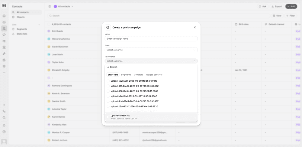
We improved the visual consistency and interaction quality of the Whippy dashboard, making everyday surfaces feel tighter, clearer, and more unified across light and dark mode.
What's included
- Core layout components: Page layouts, sidebars, tables, drawers, dialogs, pickers, and tabs now share consistent spacing, borders, and structure.
- Composer tools: Message templates, signatures, and audience pickers got clearer browse and select flows, reducing time spent hunting through cluttered menus.
- Cross-app consistency: Lists, Settings, Sequences, Workflows, Contacts, and Home now use the same visual language for spacing, borders, and hover states.
- Interaction details: Search fields, date pickers, empty states, and overlays received small refinements that make them feel more finished in both light and dark mode.
How it works
These changes apply automatically across the dashboard. No configuration or setup is required. Existing workflows, saved views, and automations continue to function exactly as before. Only the visual presentation and interaction feel changed.
Why it matters
A consistent design system reduces friction in daily use. When every screen follows the same visual rules, common actions like composing a message or picking an audience become faster and more predictable, since users aren't relearning patterns from screen to screen.
This update also sets a foundation for future releases. New features built on Whippy's design system can reuse these same components, which means faster delivery and fewer inconsistencies as the product grows.
Notes
This is a visual and interaction update only. No underlying data, permissions, or integrations were changed.